


Color is not just a design choice in ecommerce—it’s a conversion tool.
Before a shopper reads your product description, checks your pricing, or even scrolls down your homepage, they’ve already formed an impression. And more often than not, that impression is driven by color.
From trust-building blues to urgency-driven reds, color psychology directly influences how users feel, behave, and ultimately decide to buy. It shapes brand perception, improves navigation, and can significantly impact your store’s conversion rate.
In ecommerce, where decisions happen in seconds, understanding how to use color strategically can be the difference between a bounce and a sale. In this guide, we’ll break down how color psychology works, what different colors communicate, and how to apply it effectively to build a high-converting ecommerce store.
Why Color Psychology Matters in Ecommerce
Color influences user behavior faster than any other visual element. It operates on a subconscious level, guiding decisions without users even realizing it.
It shapes first impressions instantly
Users form an opinion about your website within seconds. Color plays a major role in determining whether your store feels trustworthy, premium, affordable, or even confusing.
A poorly chosen color palette can make a store feel unprofessional. A well-thought-out palette can immediately build credibility.
It drives emotional decision-making
Most ecommerce purchases are emotional first and logical second. Color triggers emotions that influence those decisions.
- Warm tones can create excitement or urgency
- Cool tones can create calmness and trust
- Neutral tones can create sophistication or clarity
These emotional cues help guide users through the buying journey.
It improves usability and navigation
Color is also functional. It helps users:
- Identify clickable elements
- Understand hierarchy
- Navigate pages more easily
A well-structured color system reduces friction and keeps users engaged.
Understanding the Psychology Behind Colors
Color is more than a visual element—it’s a psychological trigger that shapes how users perceive your brand and interact with your store. Each color carries its own emotional weight and meaning, influencing everything from trust and urgency to comfort and excitement.
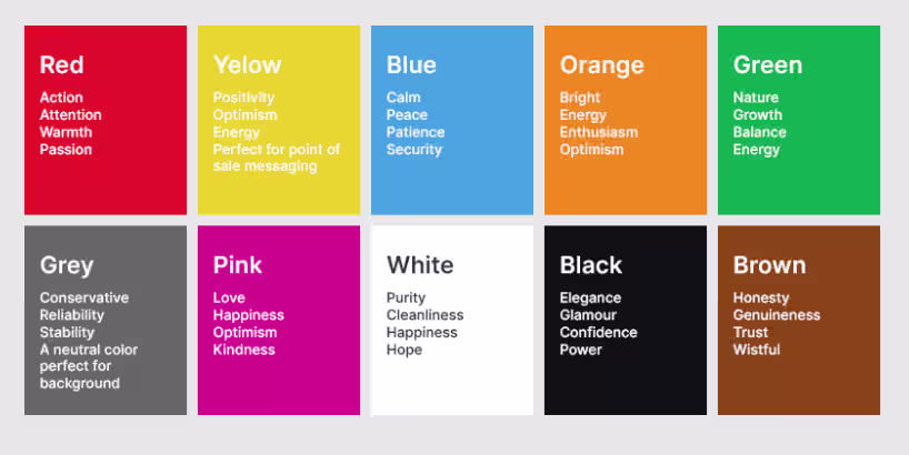
By understanding what different colors communicate, you can make intentional design choices that guide user behavior, highlight key actions, and create a more engaging shopping experience.
1. Red: Urgency, action, and excitement
Red is one of the most powerful colors in ecommerce. It creates a sense of urgency and is often used for:
- Sale banners
- Limited-time offers
- CTA buttons
It encourages quick decision-making and can increase click-through rates when used correctly. However, overusing red can feel aggressive or overwhelming, so it’s best used strategically.
2. Blue: Trust, security, and reliability
Blue is widely associated with trust and stability. That’s why it’s commonly used in:
- Payment pages
- SaaS platforms
- Tech-driven ecommerce brands
If your goal is to build credibility and reduce purchase hesitation, blue is a strong choice.
3. Green: Growth, calmness, and health
Green is often associated with nature, balance, and wellness. It works especially well for:
- Eco-friendly brands
- Health and wellness products
- Sustainable ecommerce stores
It creates a calming effect and signals safety and positivity.
4. Yellow: Optimism and attention
Yellow grabs attention quickly. It conveys:
- Positivity
- Warmth
- Energy
But it should be used sparingly. Too much yellow can cause visual fatigue. It works best for highlights and accents.
5. Orange: Energy and friendliness
Orange blends urgency with approachability. It’s often used for:
- CTA buttons
- Promotions
- Budget-friendly brands
It feels less aggressive than red but still encourages action.
6. Black: Luxury and sophistication
Black is commonly used by premium and luxury brands. It communicates:
- Exclusivity
- Elegance
- Authority
When paired with minimal design, black creates a high-end shopping experience.
7. White: Simplicity and clarity
White space is just as important as color. It improves:
- Readability
- Focus
- Product visibility
Minimalist ecommerce stores often rely on white to let products stand out.
Where Color Has the Biggest Impact on Your Store
Color doesn’t impact every part of your ecommerce store equally. Some areas play a far bigger role in shaping user behavior, guiding navigation, and driving conversions. From the moment a visitor lands on your homepage to the final checkout step, strategic use of color can influence what they notice, where they click, and how confident they feel about making a purchase. Understanding where color matters most helps you prioritize design decisions that actually move the needle.
1. Homepage design
Your homepage sets the tone for your brand. Color here should:
- Reflect brand identity
- Guide users toward key sections
- Highlight promotions or categories
A cluttered or inconsistent color palette can confuse users instantly.
2. Call-to-action buttons
CTA buttons are where conversions happen. The right color can significantly improve performance. Best practices include:
- Using high contrast
- Keeping CTA colors consistent
- Avoiding blending with background elements
Your “Add to Cart” or “Buy Now” button should always stand out.
3. Product pages
Product pages should prioritize clarity. Color should:
- Highlight product images
- Support readability
- Avoid distraction
Too many bright colors can shift focus away from the product itself.
4. Checkout flow
This is where trust matters the most. Use calming, consistent colors to:
- Reduce anxiety
- Build confidence
- Encourage completion
Consistency from homepage to checkout creates a seamless experience.
Six Best Practices for Using Color in Ecommerce Design
Understanding color is one thing. Applying it correctly is what drives results. Using color effectively in ecommerce isn’t just about picking shades that look good—it’s about making intentional design decisions that enhance usability, reinforce your brand, and drive action.
The right approach to color can improve readability, highlight key elements, and create a seamless shopping experience. By following proven best practices, you can turn color into a strategic tool that supports both user experience and conversions.
1. Build a consistent color system
Choose:
- One primary color
- One secondary color
- One accent color
This creates visual harmony and makes your store feel professional.
2. Focus on contrast and hierarchy
Contrast helps users understand what matters. Use it to:
- Highlight CTAs
- Separate sections
- Improve readability
Without contrast, users struggle to navigate.
3. Keep your palette simple
More colors don’t mean better design. Too many colors can:
- Confuse users
- Reduce trust
- Make your store look unprofessional
Stick to a focused palette that aligns with your brand.
4. Optimize for accessibility
Your store should be usable by everyone. Ensure:
- Text is readable against backgrounds
- Colors are distinguishable
- Important actions are not color-dependent alone
Accessibility is not optional—it’s essential for growth.
5. Adapt for mobile and dark mode
Mobile users make up a huge portion of ecommerce traffic. Your colors should:
- Maintain contrast on smaller screens
- Work in both light and dark modes
What looks good on desktop may not work on mobile.
6. Test and optimize continuously
There is no universal “best color.” What works depends on your audience. Run A/B tests on:
- CTA colors
- Background shades
- Banner designs
Even small changes can lead to noticeable improvements in conversion rates.
Common Color Mistakes That Hurt Conversions
Even the most visually appealing ecommerce stores can lose sales if color is used incorrectly. Poor color choices can create confusion, reduce trust, and make it harder for users to take action. From weak contrast to inconsistent palettes, these mistakes often go unnoticed but have a direct impact on conversions. Identifying and avoiding them is key to creating a smoother, more effective shopping experience.
- Using colors without strategy: Choosing colors based on personal preference instead of user psychology leads to poor results. Every color should serve a purpose.
- Overloading the design: Too many bright or conflicting colors can overwhelm users. This leads to: Decision fatigue, Lower engagement, Higher bounce rates.
- Poor contrast in CTAs: If users can’t easily spot your CTA, they won’t click it. Your action buttons should always stand out.
- Ignoring cultural differences: Color meanings vary across cultures. For global ecommerce brands, this matters. For example: White may symbolize purity in some regions, but mourning in others. Always consider your target audience.
How to Choose the Right Color Palette for Your Ecommerce Brand
Choosing the right color palette is not just a creative decision—it’s a strategic one that defines how your brand is perceived and how users interact with your store. The colors you select should align with your brand identity, resonate with your target audience, and support your conversion goals. By approaching this process thoughtfully, you can create a cohesive visual experience that feels intentional, memorable, and easy to navigate.
Start with your brand identity
Ask yourself:
- Is your brand premium or affordable?
- Is it playful or serious?
- Is it modern or traditional?
Your answers will guide your color choices.
Understand your audience
Different audiences respond differently to colors.
For example:
- Younger audiences may prefer bold colors
- Luxury buyers may prefer muted tones
Design should reflect who you’re selling to.
Analyze your competitors
Look at what others in your niche are doing. But don’t copy—differentiate.Your color palette should help you stand out while still feeling familiar to your audience.
Use color to guide user flow
Color should lead users through your site. For example:
- Highlight categories
- Emphasize offers
- Draw attention to CTAs
Think of color as a navigation tool.
Applying Color Psychology to Dropshipping Stores
Dropshipping stores often struggle with trust and differentiation. Color can solve both. A well-designed store:
- Feels credible
- Looks professional
- Builds confidence quickly
When you’re sourcing high-quality products and presenting them through a polished storefront, platforms like Alidrop naturally complement this experience by ensuring your product offering aligns with the premium feel of your design.
Your store should not feel like a generic template. Color is one of the easiest ways to create a unique identity.
Future Trends in Ecommerce Color Design
Color trends evolve with user behavior. Some emerging trends include:
- Dark mode optimization: More users prefer dark interfaces. Brands are adapting their palettes to maintain readability and aesthetics.
- Gradient and dynamic colors: Gradients are making a comeback, especially in modern UI design. They add depth and visual interest.
- Personalization: AI-driven stores may soon adjust color themes based on user behavior or preferences.
Conclusion
Color is one of the most powerful yet underestimated tools in ecommerce design.
It influences how users feel, where they look, and what they do next. When used strategically, it can improve trust, guide navigation, and increase conversions without changing your product or pricing.
The key is not choosing the “best” color—but choosing the right color for your brand, your audience, and your goals.
For ecommerce businesses looking to stand out, combining thoughtful design with a strong product offering creates a complete experience. That’s where platforms like Alidrop fit naturally—helping ensure that what you showcase visually is backed by quality products and reliable suppliers. When color, design, and product experience align, conversions follow.
FAQs About Color Psychology in Ecommerce
What is color psychology in ecommerce web design?
Color psychology in ecommerce web design refers to how different colors influence customer emotions, perceptions, and buying decisions. The right color choices can build trust, create urgency, and guide users toward actions like clicking a CTA or completing a purchase.
Which color is best for increasing ecommerce conversions?
There is no single “best” color, but high-contrast colors like red, orange, and green are often used for call-to-action buttons because they stand out and encourage clicks. The effectiveness depends on your brand, audience, and overall design.
How do colors affect customer buying behavior?
Colors trigger emotional responses that influence decisions. For example, blue builds trust, red creates urgency, and green signals safety. These emotional cues can impact how long users stay on your site and whether they complete a purchase.
Should ecommerce websites follow color trends or brand identity?
Brand identity should always come first. While trends can inspire design updates, your color palette should remain consistent with your brand values and audience expectations to maintain trust and recognition.
How many colors should an ecommerce website use?
Most ecommerce stores work best with a simple palette of 2–4 main colors, including a primary, secondary, and accent color. This keeps the design clean, improves usability, and ensures important elements like CTAs stand out clearly.


%201.svg)


.avif)